This document details all the UI customizations and callbacks available in the Nudge Stories plugin, enabling you to have deeper control over the stories.
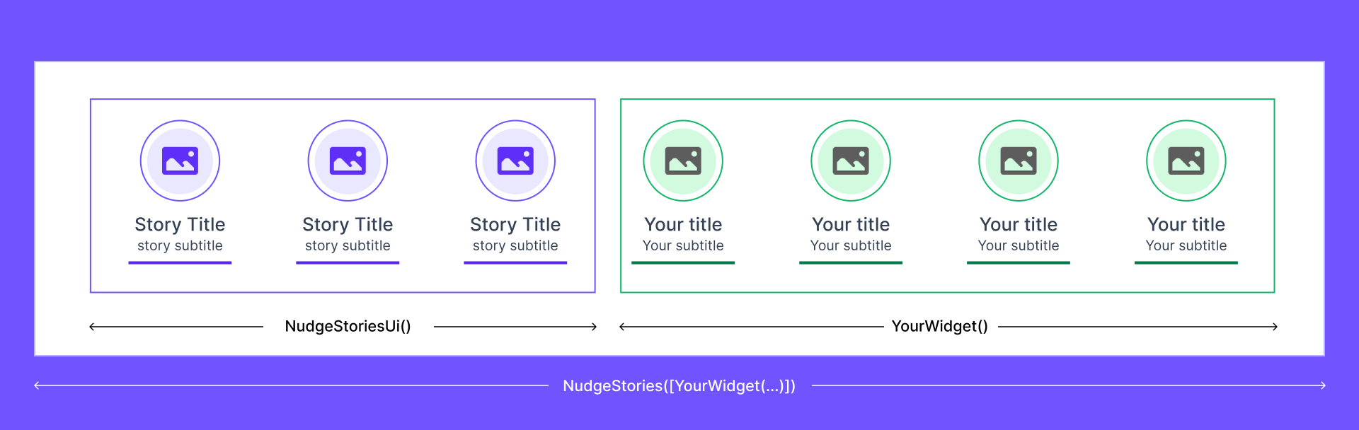
Stories come with a lot of customizations that you can do. For UI, you can customize the Stories Container and the Story itself. It's important to understand that the Stories Container is the bar that holds all the stories, while each story contains multiple slides.
Stories Container UI Customizations
This section outlines the customizations available for the Stories Container. You can modify the orientation, number of rows/columns, spacing between stories, and edge paddings.
NudgeStories(
  fontFamily: 'Abel', // Set the font family
  theme: ThemeData(
    primaryColor: Colors.orangeAccent,
    fontFamily: 'Dosis',
  ), // Customize the theme
  children: [...], // Any list of widgets
),
Story Cover UI Customizations
This section details the customizations available for individual stories within your Stories Container. You can adjust the height, skeleton color, visibility of text, item spacing, and edge paddings.
NudgeStories(
  storyHeight: 200, // Set the height of the story cover
  skeletonColor: Colors.grey, // Set the color for the story cover skeleton
  showText: true, // Show or hide text on the story cover
  itemSpacing: 10, // Set the spacing between items in the story cover
  horizontalEdgePadding: 10, // Set horizontal padding for the story cover
  verticalEdgePadding: 10, // Set vertical padding for the story cover
  gradientColors: const [
    Colors.red,
    Colors.green,
    Colors.blue,
    Colors.yellow,
  ], // Apply gradient colors to the story cover
  headingLightModeColor: Colors.black, // Set heading color for light mode
  headingDarkModeColor: Colors.white, // Set heading color for dark mode
  subheadingDarkModeColor: Colors.red, // Set subheading color for dark mode
  subheadingLightModeColor: Colors.blue, // Set subheading color for light mode
  thumbnailSize: 100, // Set the size of the story thumbnail
  children: [], // Add child widgets
)
Callbacks
Nudge provides several callbacks to handle various events. These callbacks allow you to execute code in response to specific actions related to the stories.
NudgeStories(
  onLoaded: () {
    log('Stories loaded: ', name: 'NudgeStories'); // Triggered when stories are loaded
  },
  onStoryDismissed: () {
    log('Story dismissed: ', name: 'NudgeStories'); // Triggered when a story is dismissed
  },
  onLoadFailed: () {
    log('Stories failed to load: ', name: 'NudgeStories'); // Triggered when stories fail to load
  },
  onStoryTap: () {
    log('Story tapped: ', name: 'NudgeStories'); // Triggered when a story is tapped
  },
)
Working with List View builder
NudgeStories (
children : [
   ListView.builder(
      scrollDirection: Axis.horizontal,
      itemBuilder: (context, index) {
        return Container(
          margin: const EdgeInsets.only(right: 10),
          height: 100,
          width: 100,
          color: Colors.grey,
        );
      },
      itemCount: 5,
      shrinkWrap: true, // Important, this makes the list view builder take the space that it needs
    ),]
)
Handling multiple scrollable widgets
Incase you plan to add our story widget along with an existing scrollable widget, you refer to the below snippet to handle the scroll across both widgets seamlessly.
const NudgeStories(
  customContent: [YourWidget1(...), YourWidget2(...), ...] // @type: List<Widget>
),